
Whether you’re designing your brand for the first time or repurposing it, color will make or break your brand and product. Color branding should be a top priority when marketing. Below, we’ll teach you why color matters, how to avoid common misconceptions, and how to make color work for you and your brand.
Parts of Color
Before we move into marketing itself, it’s important to understand the parts of a color and why each matter to marketing. These three parts are: Hue, value, and chroma.
Hue refers to the color name, like red, blue, or green. Value is how light or dark a color is, while chroma refers to color intensity.
One big mistake marketers make is to focus entirely on hue. This not only leads to poorer designs, but relies on misconceptions and stereotypes (in more detail below).
Value and chroma matter just as much as hue in marketing. Changing these can make your consumers excited or relaxed, give off a certain personality, or alter their final goal with your product.
Misconceptions about Color and Marketing
Most of the color theory assigning emotion to color branding is too general and based on stereotypes. For example, these are the kinds of emotions tied to colors on charts all over the Internet:
- Red is angry
- Blue is calm
- Yellow is happy
They may not be entirely wrong depending on our experiences and associations with the color. However, marketers and designers can’t take these color theory charts seriously because they ignore context.
For example, some people will associate white with anything from snow sports to death to blandness to purity. Some people have had good experiences with blue, and others have negative thoughts about any cool tones. Some colors can even evoke a response based on where a customer went to school!
Another problem is that many color/emotion charts focus on Western or American contexts. This can lead to disaster for international and global companies.
It’s impossible to gauge this information for your entire audience. But by studying your audience and niche, you can infer what kind of personality your product attracts. It’s easy then to make deductions from that point instead of guessing.
Fitting color to your product
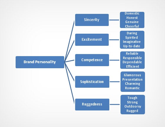
A study by Stanford professor and psychologist Jennifer Aaker shows five core dimensions of a brand’s personality:
However, though some colors seemingly align with these five traits, it will benefit your brand far more to focus on the personality you want to convey. Think reasonably for your product. Does the color “fit” what’s being sold? Even if pink has certain associations, you probably won’t use it on your website header to sell camping and hunting gear.
Also, consider the semantic meaning of certain colors. For example, it’s not a good idea to put a bold red on headache medication. Since red is still “aggressive,” it doesn’t carry the right personality and sensation for your product. A migraine sufferer may shy away from your product and its short wavelength and bright, warm hue.
This chart, though still somewhat stereotypical, has a good run-down of color and the above brand traits. 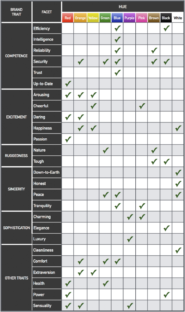
Colors in Action
Though you may not always achieve a “cheerful” or “calming” vibe just by picking yellow or blue, colors still drive certain psychological responses. Keep in mind that these are still based off a Western viewpoint. Remember to research your audience’s needs!
Overall in branding and product coloring, warm colors drive action while cool colors invite calm. Warm colors increase emotional arousal and can reduce rational thought. These hues on a product or on an advertisement can then encourage impulse purchasing.
Cool colors, on the other hand, do just the opposite. They invite calm and relaxation. But if you can encourage impulsivity, why would you want something that doesn’t drive action?
Simple: relaxed customers spend more time on your site or in your store. Relaxation makes time seem to fly by faster. Plus, they’ll perceive faster checkout rates and walk away more satisfied than if they felt they had a long wait.
Regarding multiple hues: it’s easy to add as many or as few colors as you like together and call it good. But color compilations are most effective when combined with the right products.
A broad variety of colors in an ad go well with hedonic (for fun and pleasure) products and brands and less information in an ad. Simpler palettes, on the other hand, fit utilitarian (for business and home) products, and are good for conveying the most information.
Next time you analyze your designs and brand, this information can help you pick the best strategic colors for your company. If you have a great design you’d like to see in print, let Alexander’s know! Our state-of-the-art printing can help your design shine.