

Most people are familiar with color psychology to a degree, and why color matters in marketing. But you may not know that fonts work much the same way. Our associations with fonts trigger powerful emotions and ideas. Like choosing color, selecting your font helps you market effectively and can fill in the gaps of your design. Fonts can even overpower color associations in a logo or design. We’ll show you how you can choose the best fonts for your brand or product.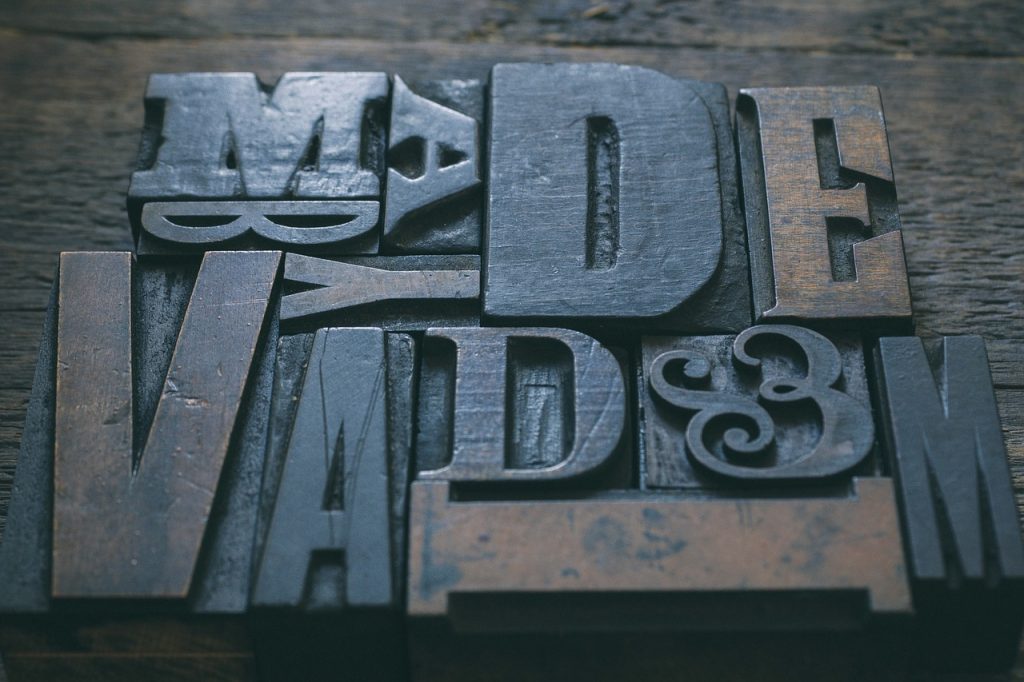
Mood and Style
Before you pick your fonts, know your product, your mood, and your audience. All fonts have a personality. Plus, your audience may or may not react to your product the way you would like if it doesn’t “match.” Elegant scripts that you’d use for a wedding invitation won’t go with real estate advertisements. You probably also won’t sell prom dresses with a rugged, hyper-masculine font.
Legibility
Even if you can make an unexpected font work for your brand, product, or website, its look will fail if it’s illegible. If your audience has to guess at letters, that isn’t a good font to use.
Some fonts that work well for headers—like some script or fancy fonts—won’t work for body text. Overlapping loops and lines quickly become far too difficult to read. This is also true for ultra-bold or extremely thin fonts that may blur together or strain your readers’ eyes. Stick with plainer but easier-to-read typefaces.
Fonts to Avoid

Via http://anchoreddesign.com/awful-fonts/
Fonts such as Papyrus, Scriptina, Comic Sans, and others you’ll see on “Do Not Use This Font” charts should probably stay off your site and advertisements. Why? It may be that they have no business being in a professional setting because they’re too childish and silly, in the case of Comic Sans, or overused, in the case of Scriptina. Most of them, however, are simply poorly-designed or overused. Papyrus falls in both these categories.
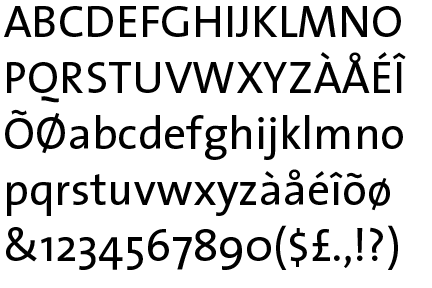
Sometimes, it’s also just the fault of one or two letters, like in TheSans. That Q ruins the look of the rest of the font with its abrupt silliness, where the rest of it looks all right.
Used appropriately, these fonts aren’t always bad. But keep in mind with touchy, overused fonts like these—the keyword is appropriately. Do your research on these fonts and decide if they’re really your best option. Otherwise, you risk losing credibility for your business!
Typefaces
The different types of typefaces hold various associations for your audience. As with color, not every font will make every audience feel the same way.
- Serif: Often used in print over webpages, serif fonts represent tradition, comfort, and authority.
- Sans Serif: This typeface showcases stability, objectivity, cleanliness, and being universal. Sans serif fonts are also good for webpages, blogs, and posts because of their simplicity.
- Slab Serif: Bold and modern, slab serif fonts can convey strength and solidarity.
- Script: A very personable typeface, script fonts show affection and elegance, and implies creativity.
- Display: These fonts often represent uniqueness, friendliness, and expressive creativity. These, like script fonts, make good headers or titles.
- Modern: Use a modern typeface if you want to evoke intelligence, style, and progress.
If you have a great design you’d like to see in print, let Alexander’s know! Our state-of-the-art printing can help your design shine.