

Your business card design says a lot about you. It determines what you’re focused on, whether it be professional, fun or creative. The contact information and social media channels you provide on it not only gives others your correct information, but provides a channel for people to venture to learn more about you, your business, and what you represent. Most powerfully, however, is the fact that your business card design creates an impression of you to others.
With the wide array of examples on various websites and photos on Pinterest, it can be hard knowing what you really need to include and do to for a beautiful business card design. Stress no more! Here are our secrets to designing a beautiful business card using examples from previous clients and our Pinterest board.
Secret #1: Show Off Your Profession.
What better way to make an impression to a client than to show off your profession? No matter the field you are in, there is a way to do so creatively.
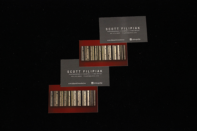
This business card explains what the person’s professions are: photographer, painter, and fine artist. The backside of the business card looks to be a unique painting but it is also a barcode, something this person paints professionally. Useful and unique, this business card is a win.
This hairstylist card not only shows off this person’s profession, but does so in a unique and personable manner. This hairstylist can offer bobby pins to each customer while making a lasting impression.

Secret #2: Use Iconography.
Display your contact Info in the best way. What better way than with icons? Iconography is HUGE in today’s world and it is only increasing in popularity. Iconography keeps your business card modern, clean, simple, and informative.
Secret #3: Shape Accordingly.
The standard business card is 3.5 x 2 in. While it is best used for non-artistic fields, uniquely shaped business cards grab attention.
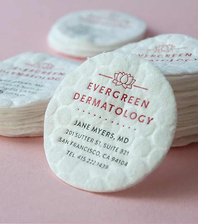
This dermatologist’s business card is printed on a cotton pad, making it obvious of her profession while grabbing attention with a round shape.
Secret #4: White Space is Not Wasted Space.
In the old days, white space was a bad thing. In today’s world, people are bombarded with information! Too much information can be overwhelming, so don’t be afraid to frame your information around some classy white space. The business card below is an example of keeping information to a minimum while still displaying necessary contact information.

Secret #5: Make It Pop with Varnish or Foil.
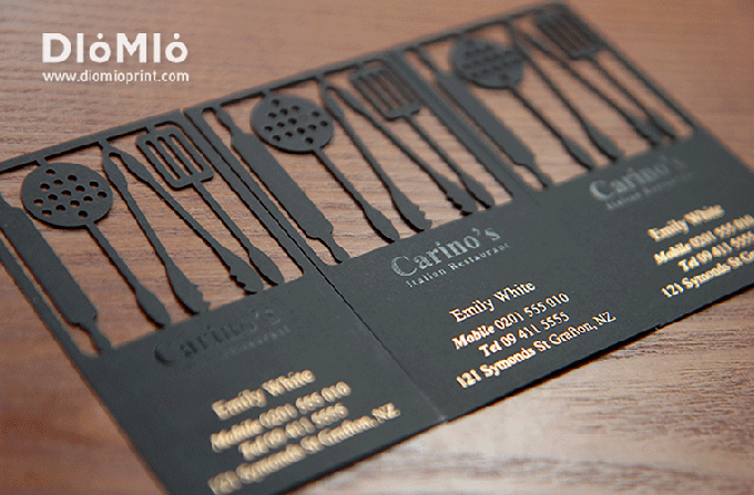
Varnish and foil are examples of touch marketing. At Alexander’s we have the machines needed to give your business card the pop it needs to stand out from the rest of them. The business card below are also showing how a laser cutter can establish a unique memory. We can make that happen for you too!
This business card features spot foil. Imagine the gold not showing through… It just wouldn’t be the same.
Remember these 5 secrets the next time you are designing your business card to create something beautiful. For personalized assistance, call our office at 801-224-8666 or fill out the contact form below. We can design your business card, print it, and ship it to you all from our headquarters in Lindon, UT. We would love to help!