We’ve been told time and time again not to judge a book by its cover, but the fact remains that we do. Beautiful book covers are sure to grab attention, helping authors get their work noticed. These 10 beautiful book covers certainly grab attention. Below each of them, we’ve explained what makes them so successful to help inspire you while designing your book’s cover.
Halo by Alexandra Adornetto

This cover is successful for many reason. The first is that the image is sharp and clear. The second is the tension captured within the image in the strong diagnal lines, as well as the emotional tension of that almost-kiss.
She by Annabel Fanning

This cover has a rich achromatic color palette that catches the eye. The high contrast between the dark background and the white font really makes this cover jump out. Note how beautifully the typography is used: the thin fonts of the author’s name nicely complement the thin lines in the cursive font. Additionally, the author’s name in a light blue sets it apart without making it feel like its overwhelming the title.
Ella by Jessilyn Stewart Peaslee
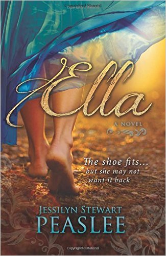
This book cover succeeds for many reasons. The diagonal lines of the skirt give tension, as does the captured action of the girl walking away. Rich colors are beautifully used to give attention to the author and title in a way that isn’t crass or overwhelming. Additionally, the texture found in the waves of the skirt, the prickly ground, and the title font make the eye linger. And did you notice the soft watermarks around the bottom edge that draw the eye to the author’s name?
Tumble and Fall by Alexandra Coutts
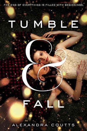
This cover’s main success is the beautiful typography. The ampersand curls around the faces of the characters, highlighting what’s most important. Note how the tuck of the ampersand brings tension to where the boy’s lips almost touch the girl’s skin. This cover would have failed completely if the ampersand had covered eyes, or poked into the boy’s ear, or the girl’s nose. Controlling typography can create a powerful book cover.
Becoming Beauty by Sarah E. Boucher
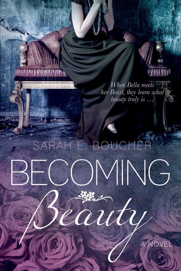
This cover’s soft colors and achromatic color palette make this book feel harmonious. However, what really makes this cover stand out is the texture. Note the roughness of the wall, the ruffled silk on the couch, the swaths of the fabric, and the texture of each rose. Texture gives the eye something to explore, and consequently will attract the gaze of potential readers again and again.
The Knight of Redmond by Jennifer K. Clark
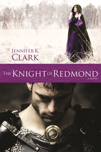
It can be difficult to blend separate pictures well, but this cover is an excellent example of a successful blend. Note how the light tones in the top picture match the knight’s skin. Likewise, see how the darkness of the bottom image is pulled upward by the maiden’s cloak. A rich streak of purple unites both the images. The use of color in this cover creates a sense of harmony.
My Sister’s Grave by Robert Dugoni
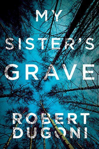
This cover succeeds because of the unique perspective: the view of a body staring up at the sky. Though the colors are wonderful, and the font is legible, it’s the cleverness of this image matching the title that makes this cover so successful.
Cruel Crown by Victoria Aveyard
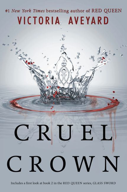
Cruel Crown’s cover succeeds because a beautiful image perfectly personifies the words. The splash of the fallen water droplet implies that someone in this book is going to “make a splash”. Specifically, a royal someone, if the splash’s form of a crown is anything to judge by. Add to it the splatters of red that draw the eye in while hinting at danger? This cover is a success.
No Perfect Destiny by Jackie Weger
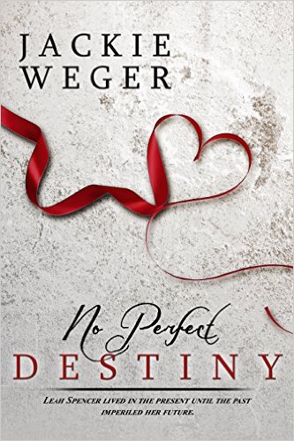
Many covers succeed because they unite complex elements well, but this cover succeeds because of its simplicity.The ribbon curling in the form of an asymmetrical heart creates a mood that draws the viewer in. With many covers, the secret of success lies not in what the cover looks like, but in how it makes the viewer feel.
Lucky Us by Amy Bloom
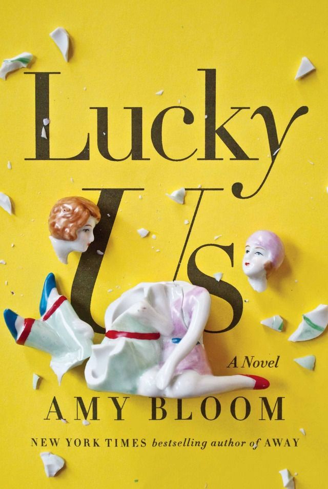
Create a powerful cover by using irony. In this example, the shattered porcelain figures partially covering the text, “Lucky Us,” clearly implies that this book tells a story about two people who are anything but lucky.
Looking for a Place to Print Your Books?
Though not a publishing house, Alexander’s is a printing house. We’ve helped self published authors and publishing houses print their books, and we can help you too. Contact us to get started.