The truth is, we judge all books by their cover. The design of a book helps sell the stellar content inside. Or, it can ensure the book never sells because there’s nothing to make it stand out. This goes beyond just design to the other elements used in your cover. So how can you make sure your book stands out among the thousands of others on the market?
Design
Cover design will make or break your book sales. This is the first element to making any book stand out in a crowded market. If there’s nothing attention-grabbing about the design, or–worse–if the look is shoddy, no one will pick it up off the shelves.
Make sure your cover is something to get excited about during a big reveal. And, without revealing too much, make sure it tells in a single image what your story is really about.
Check out the cover of Cinder by Marissa Meyer as an example.

That eye-catching red draws attention right away, while the single image paired with that title informs the viewer immediately that it’s a retelling of Cinderella–with a twist. It’s striking, simple, and went on to create great branding for the other books in the series.
We have other excellent book covers that have caught our eye in the past. Check them out for other great ideas on designing a winning cover!
Varnish
Varnish is becoming more popular on book covers every year as the technology improves. Many authors put spot varnish on the titles of their books for a little extra shine. While that won’t show up as a thumbnail, it certainly makes a book stand out in the store as customers browse the shelves.

Other designers incorporate varnish right into the design of the book. In the case of these bottles, it imitates the shine of light on glass. Or, you can use it to emphasize just an important part of a design, if you choose, rather than making too much of your cover glossy.
Foil

Coloring books like Johanna Basford’s Secret Garden made foil popular on coloring books. This was an excellent way to add color to an otherwise black-and-white cover while allowing buyers to color it in if they chose. It’s also great for hardbound classics to convey that sense of timelessness and knowledge.

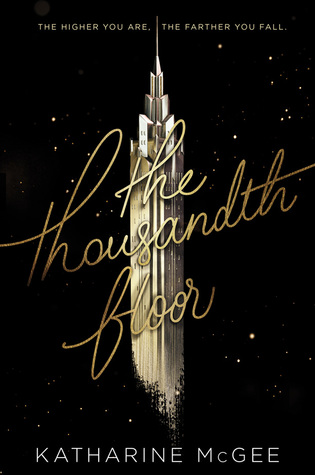
Of course, you don’t have to be limited to certain genres. The Thousandth Floor used foil on its cover to excellent effect, not only catching the eye but fitting well with the theme of the book.
Tactile Covers

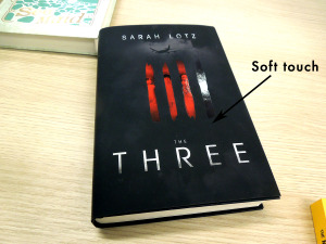
Laminates do a great job of touch marketing on their own or in conjunction with foil and varnish. Using soft-touch on a cover is especially effective, since it makes your cover or book jacket feel like velvet.

Another way to use touch on your cover is to introduce a cut-out, if possible. Often this is common with children’s books. But it can be for all genres, done right. This edition of The Curious Incident of the Dog in the Night-Time has an empty space with the poodle, using the black background of the front matter to fill it in.
Now it’s your turn!
Have a great idea for a book cover? Contact us at Alexander’s! We can print your design or create one just for you. Call our office at 801-224-8666 or fill out the contact form below to get started. We would love to help you!


