A lot of work and thought goes into great business card design. You need to be able to stand out from the crowd and convey your brand, specialty, and standards at a glance. These great business card designs did just that, combining color, shape, and icons to stay memorable in clients’ minds.
Branding with Design
Business owners and employees will need to show off what business or profession they’re in rather than relying on a blank card. Even a colorful one that tells nothing about your business can be easily forgotten. These cards help customers remember the type of business or that employee’s specialties at a glance.

With neatly trimmed lines, the “hairs” on this card not only imprint the business card as a hairstylist’s, but frame the name with a great design. Plus, with a bit of de-bossed texture in the cardstock, this card uses touch marketing to make customers handle it longer. By doing this, they’ll associate stronger and more positive memories with the card and therefore the stylist.
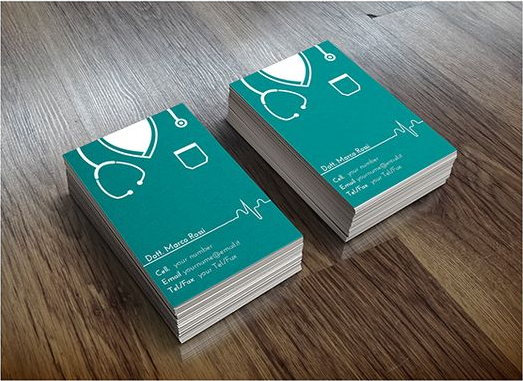
Again using familiar and eye-catching design, this card calls to mind medical scrubs in both look and color. There’s also the line of a heartbeat monitor to underscore the name, hinting at cardiology or general health as the doctor’s specialty.
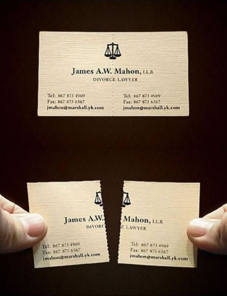
Very cleverly, the card of this divorce lawyer uses perforation for easy tearing. Plus, the contact information remains on both sides of the card for emphasis that his clients are moving their separate ways.
Showcasing Talent

Everyone who uses a business card will need some way to prove they know what they’re doing–especially artists and graphic designers. This illustrator and artist drew art for their business card to showcase their style right away to potential clients. Yet the card is also well-balanced, letting the contact information stand out and remain legible. From a glance, this artist knows very well what they’re doing, and would be worth the investment.
Utility
Even the best business cards can go unnoticed if there’s nothing to draw a recipient back to them. One way to ensure your business cards don’t get tucked in a wallet, never to be seen again, is to make them useful.
You could argue that business cards are already useful, but going the extra mile could keep your card on a desk in full view, rather than hidden out of sight.
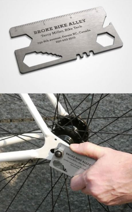
Try turning your business card into a useful tool, which will keep it constantly seen and handled. This could be as simple as adding a ruler, or turning it into a wrench to fix a bolt on a bike.
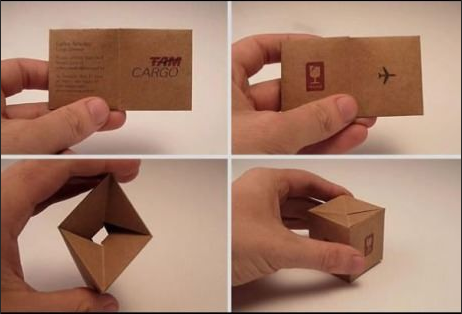
Everyone has paper clips, pins, staples, and other office hardware on their desk or in a drawer in want of organizing. This cargo company not only makes it easy to recognize their business and brand, but provides a way of storing small, real-life cargo.

And sometimes, you can let your customers enjoy a little creativity themselves. Many cards use pop-outs to create models, whether of furniture or toy cars. 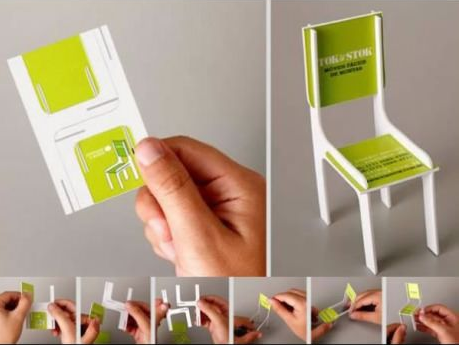
This lets your customers handle your card a lot longer, reinforcing the brand and helping build positive memories.

Done wrong, portraits can look strange on a business card. But a Finnish design company found a way to turn employees’ photos stylish, resulting in a great tool. Putting a face to the name creates a more personal touch between the business and customer. In doing this, customers and clients can connect better with an employee and establish a better relationship.
Looking for more ideas? Check out our Pinterest page, where we keep tabs on great business card designs. Or contact us today. We’d love to help you represent your business.


