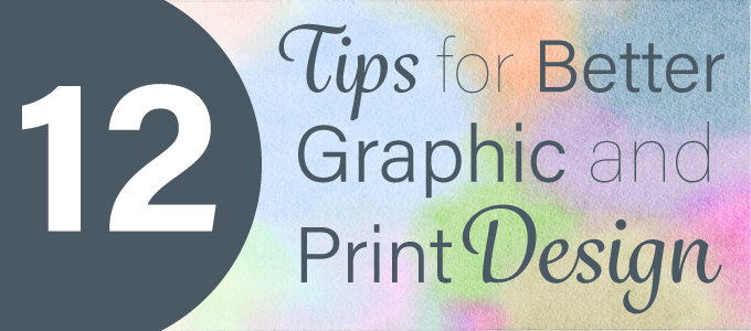
Print design is essential in the success of your printed piece. Being Utah’s leading printer, we at Alexander’s know how hard it can be learn graphic design skills. Follow these 12 tips the next time you are practicing your print design skills.
1. Remember the Theme.
Before you begin the design work, make sure you outline and define what the overall message is for the print piece. Determine who your target audience is and what kind of language and questions they would have about your product or service. As you continue through the print design process, continually refer back to the theme of the piece to make sure it stays on track to achieve the piece’s overall purpose.
2. Don’t Forget About the Bleed.
The bleed is the reason your printed piece will look polished when all is said and done. It allows the printer to cut off the edges where the ink can “bleed” off the page and cause problems to the printed piece.
3. Readability is Key.
Don’t worry – we’ll get to more print design tips next! First you need to remember that readability is key, no matter what the printed piece is. The content is what makes up the printed piece, and the print design needs to emphasize the content, not detract from it. Remember to optimize the content with easy readability.
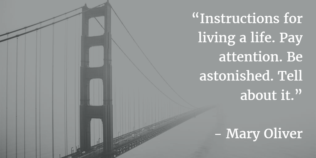
4. Copy (White) Space.
In textual terms, white space refers the space where there aren’t words or images. It emphasizes and organizes the words and content that is on the page. In print design terms white space is known as copy space, and it is the same idea. Crop or enlarge images to fill up the empty space with copy. Look at the example below to see how the copy space is filled with text.
5. Pair Contrasting Fonts.
Pairing fonts can be a challenge forfor graphic design beginners. The mood, tone, contrast, time period and more are factors in pairing fonts perfectly.
Click here for more information and advice on font pairing.
6. Match Colors.
First and foremost you need to learn the difference between CMYK and RGB color modes. Make sure your print design software (Photoshop, InDesign, Illustrator, etc) is set to CMYK. It is specific to printed collateral, whereas RGB is for web (or screen, i.e. TV) design.
Canva has a great tutorial on how to match the color of your text with the graphics in your printed piece. Click here to learn more.
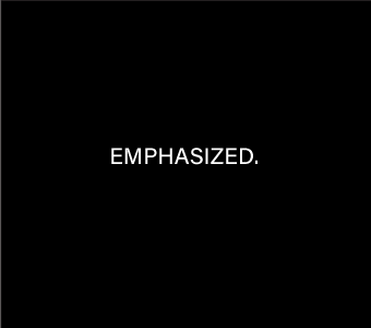
7. Invert for Emphasis.
Invert the colors to emphasize a message, logo or slogan.

8. Iconography.
Icons are great for illustrating information with shapes. Click here to see excellent examples of iconography.
9. Transparency.
Use transparency on the shapes or icons in your print piece. The example below is from a featured image on a blog post written for Divvy by Alexander’s. The box is transparent to emphasize the letters and inverted with the color black to emphasize the white letters on top of it. You may also notice how the orange colors matches the cup (tip #6) and the circle draws the eye to the number ten (tip #8).

10. Remember Resolution.
Once you get ready to print the piece, make sure that you have your programming set to track inches, not pixels.
11. Follow Trends.
If you need help getting started, look to Pinterest for some inspiration. Print design can be difficult because it is ever changing, so researching what is popular now will help you understand what you can do to stand out.
12. Practice Makes Perfect.
Remember that practice really does make perfect! Don’t expect yourself to learn print (or graphic) design overnight. The more you do and experiment, the more you will learn and the better you will become.
Do you need help designing your printed piece? Call Alexander’s at 801-224-8666 or fill out the contact form below. We can help you design your print collateral or simply answer a question you may have about the print process.